Dark Mode for Email Simulator
Dark mode has been a hot topic for email marketers and designers since 2019 when statistics from multiple studies revealed just how widely used it was. At the time, researchers found that between 82.7% and 95% of people used their operating systems in dark mode to do everything from watching TikTok videos and using Facebook Messenger to working with Microsoft Office and reading email messages.
Since that time, dark mode usage has increased, particularly since people discovered it uses less battery life on smartphones. With more people using dark mode all the time, it’s imperative that email marketers send campaigns that look great in both light and dark modes.
What Dark Mode Means for Email Marketers
Dark mode first came to iOS in 2018 with the launch of the macOS Mojave. One year later, Gmail began supporting dark mode for both Android and iOS devices, which included iOS Mail. Ever since, marketers everywhere have been worried about how their email looks when rendered in applications that support dark mode. They’re right to be concerned!
Not only do email marketers need to invest time and money into developing and designing email campaigns that render properly in dark and light modes, but they also have to make sure they have a streamlined process in place to proofread and obtain approvals on those campaigns from stakeholders.
The proofreading, QA, and approval process can become overwhelming quickly when you’re working with multiple reviewers (including internal and external stakeholders), numerous versions, dynamic content, and light and dark modes. The best way to stay organized, reduce delays, and ensure every email goes out without errors is to use a comprehensive proofing and approval solution and dark mode simulator.
Free Email Dark Mode Simulator
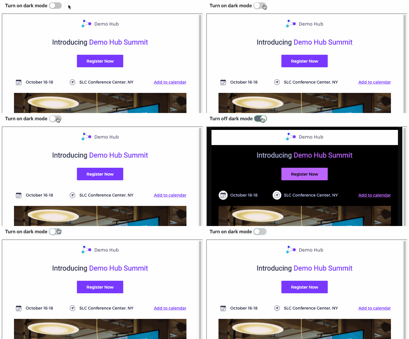
At ProofJump, we created Dark Mode for Email Simulator that mimics what you see in your email when rendered in dark mode by inverting the colors and fonts.
This way you can quickly gauge how an email you designed will look with its colors inverted and whether this would affect the legibility of your email.
This tool was built to make it easier for email marketers to see the effect dark mode has on their email campaigns.
Detect Problems with the Free Dark Mode Simulator for Email
The free email dark mode simulator from ProofJump mimics the “full invert” scheme of Gmail in iOS – one of the most popular email clients, so:
- Text and background colors are inverted – light colors become dark and dark colors become light.
- Images, including background images, are not converted, so they don’t change.
With this tool, you’re able to detect potential problems. For example, you can instantly see places where you originally have light text over a dark background image that will be problematic. That’s because in dark mode, your text will turn dark and the background will remain dark. As a result, your recipients won’t be able to read the text.
The free email dark mode simulator will also show you if your logo and icons lose contrast when your email is viewed in dark mode.

How to Use ProofJump’s Dark Mode Simulator for Email
The free dark mode simulator for email tool allows you to instantly see how your email campaign will look for recipients who use light or dark mode in just two easy steps:
- Paste the source of your email in the tool and click the Process button. You will now see the normal view of your email. To see the dark-mode-rendered version, click on the Dark Mode toggle.
- To see the email in a larger view, click on the “view in full screen” button. Now, you can edit the code and view the dark mode rendered view side-by-side.
If you’re interested in seeing how other emails in your inbox render in Dark Mode, check out our Email Source Converter tool, which allows you to get the source of your email from Gmail, Yahoo! Mail or Outlook.com.
Many Kinds of Dark Mode Create Limitations
The unfortunate truth is that many email clients that support dark mode transform emails differently. Although the Gmail client for iOS does a “full invert” in colors, clients, such as Gmail for Android as well as Outlook and the native iOS Mail clients, only do selective color inversion.
Generally, clients that do selective color inversion will only make light background colors darker while making dark text lighter and not vice versa. With selective color inversion, you may sometimes end up with the client converting a light background to a dark color while not converting the text within to a light color, rendering the email unreadable.
This is something you can only find out by testing on a real email client or by using an email-rendering service. The purpose of the dark mode for email simulator is to give you a quick glance at what issues may occur in your email but not go through all possible dark mode scenarios.
Proofing Email Campaigns Beyond Dark Mode
While we’re on the subject of checking emails, if you’re struggling with campaign QA and reviews, check out ProofJump.
ProofJump gives you a single place to get all feedback and approvals on your email campaigns without the frustration, confusion, delays, and errors that come with other review and approval options.
